Branding / Art Direction / Packaging
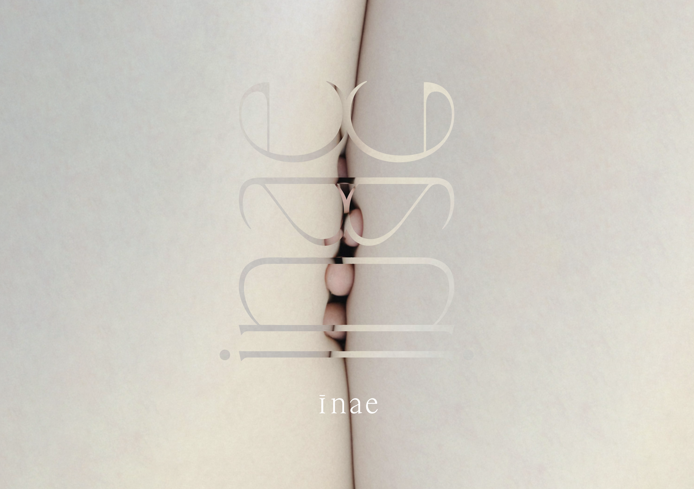
"A Symbol of Reflection"
A symbol emerges,
mirroring the essence of the brand’s name.
Delicate, flowing lowercase letters,
inspired by the soft curves of the feminine form.
"Strength in Softness"
At the heart of the design, a circle—
a symbol of strength, resilience, and wholeness.
Wrapped in flowing, gentle lines,
like water cleansing, like air embracing.
Bold yet tender, powerful yet serene,
it speaks to the beauty of balance—
where strength and softness coexist,
where every touch is a quiet affirmation of self.
Sketches of other logo ideas from earlier stage


